A bit of epidemiology and data visualisation
-
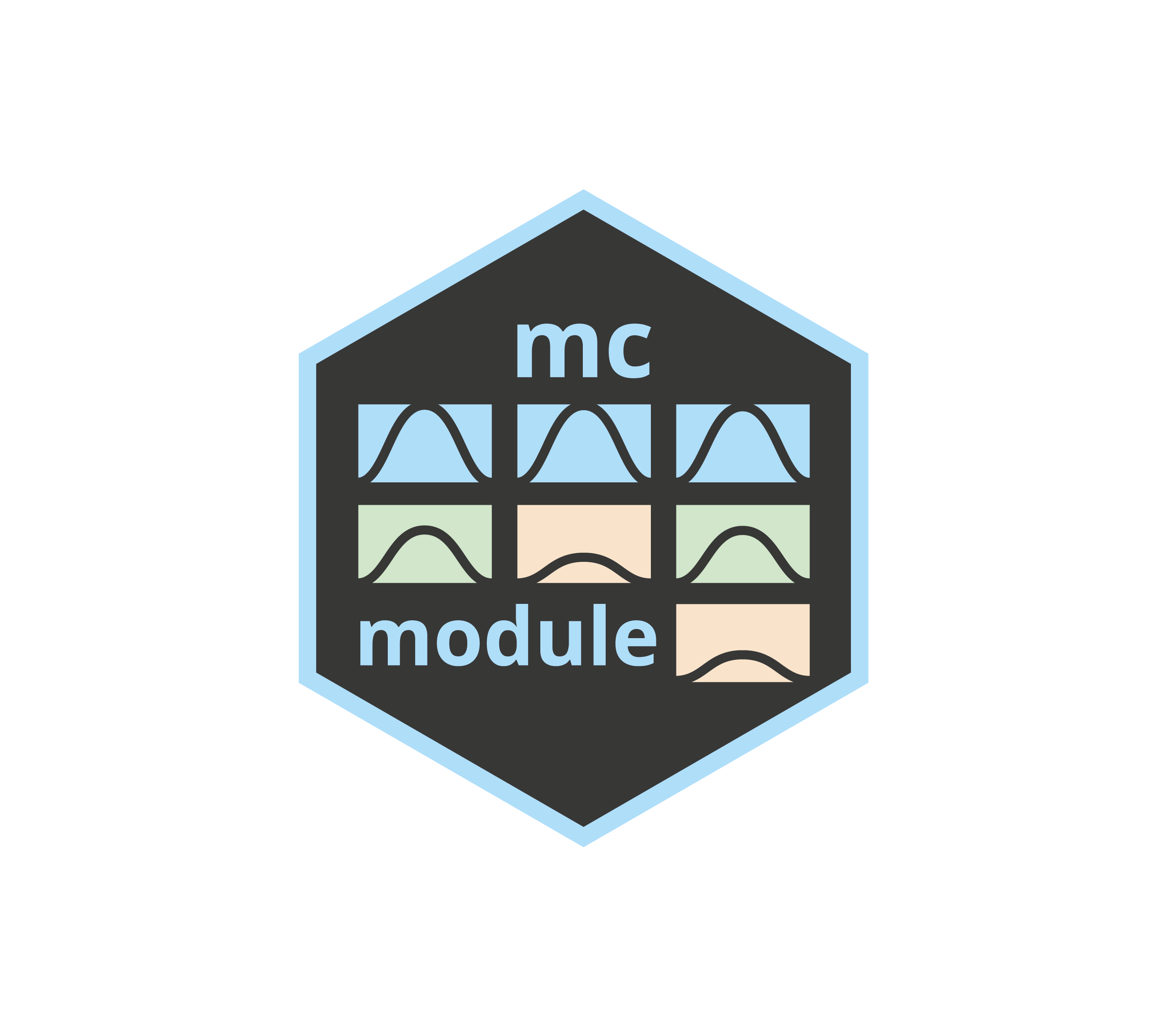
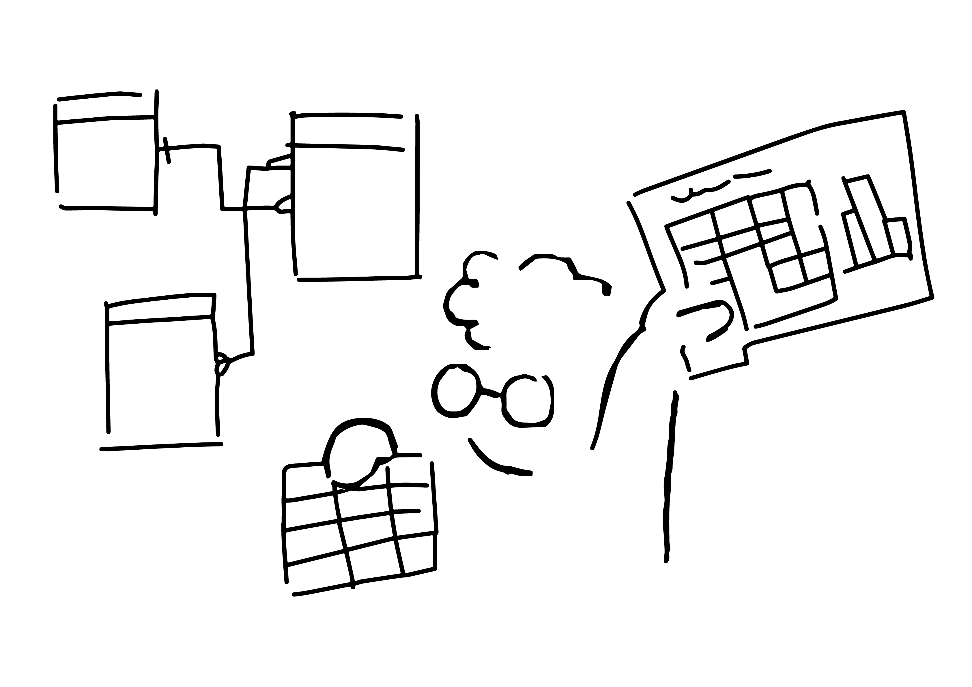
mcmodule! My R package for complex risk analysis
A few months ago, I published my first R package on CRAN. Now it has fewer bugs and more features, and I can finally share it with you: mcmodule v1.2.0 is out! 😀 mcmodule R package for building modular Monte Carlo risk analysis models. This package was born out of necessity and grew out of…
-

Quick set up of GitHub in R
After many emails sharing my tutorial to set up GitHub on Windows 11 for RStudio, I’m publishing it online. There are other ways to set this up, but this has always worked for me (and I still need it every time I try to set it up again).
-
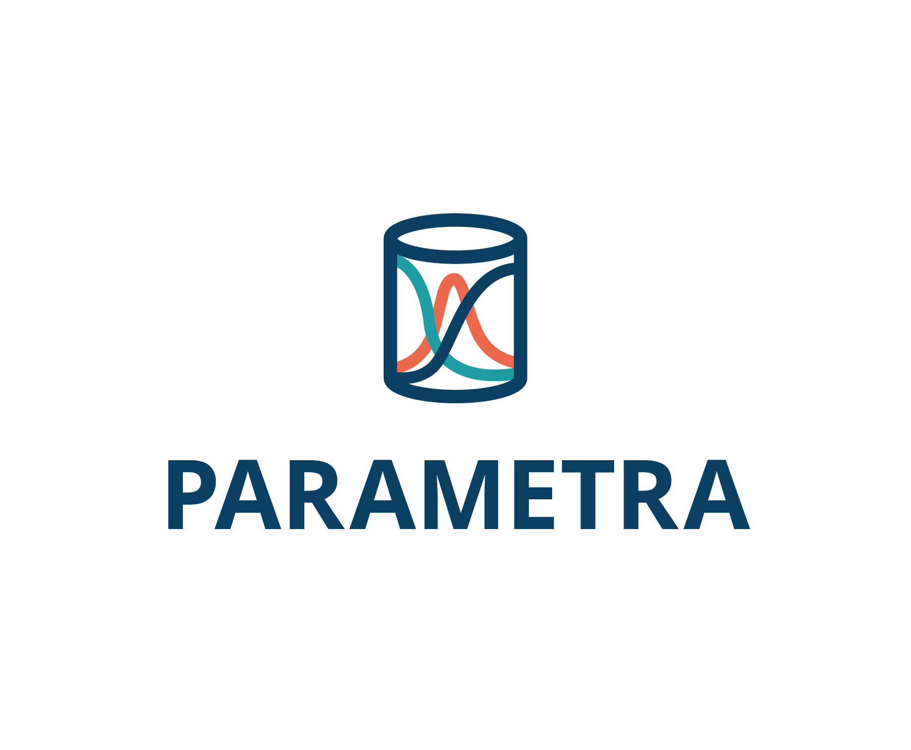
PARAMETRA: a database to find the values and the blanks for livestock pathogens
Some interactive visualizations to present our new database! We have collected over 2000 parameter values from published studies to make livestock disease modelling easier.
-

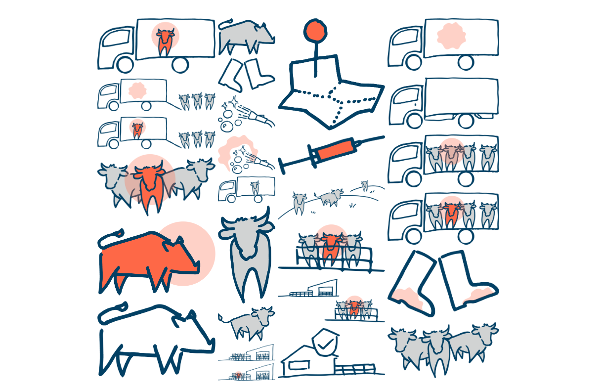
Timeline visualisations of animal reproduction
Veterinary diagrams on animal reproduction: estrous cycles, pregnancy timelines, key events, and monitoring methods.
-
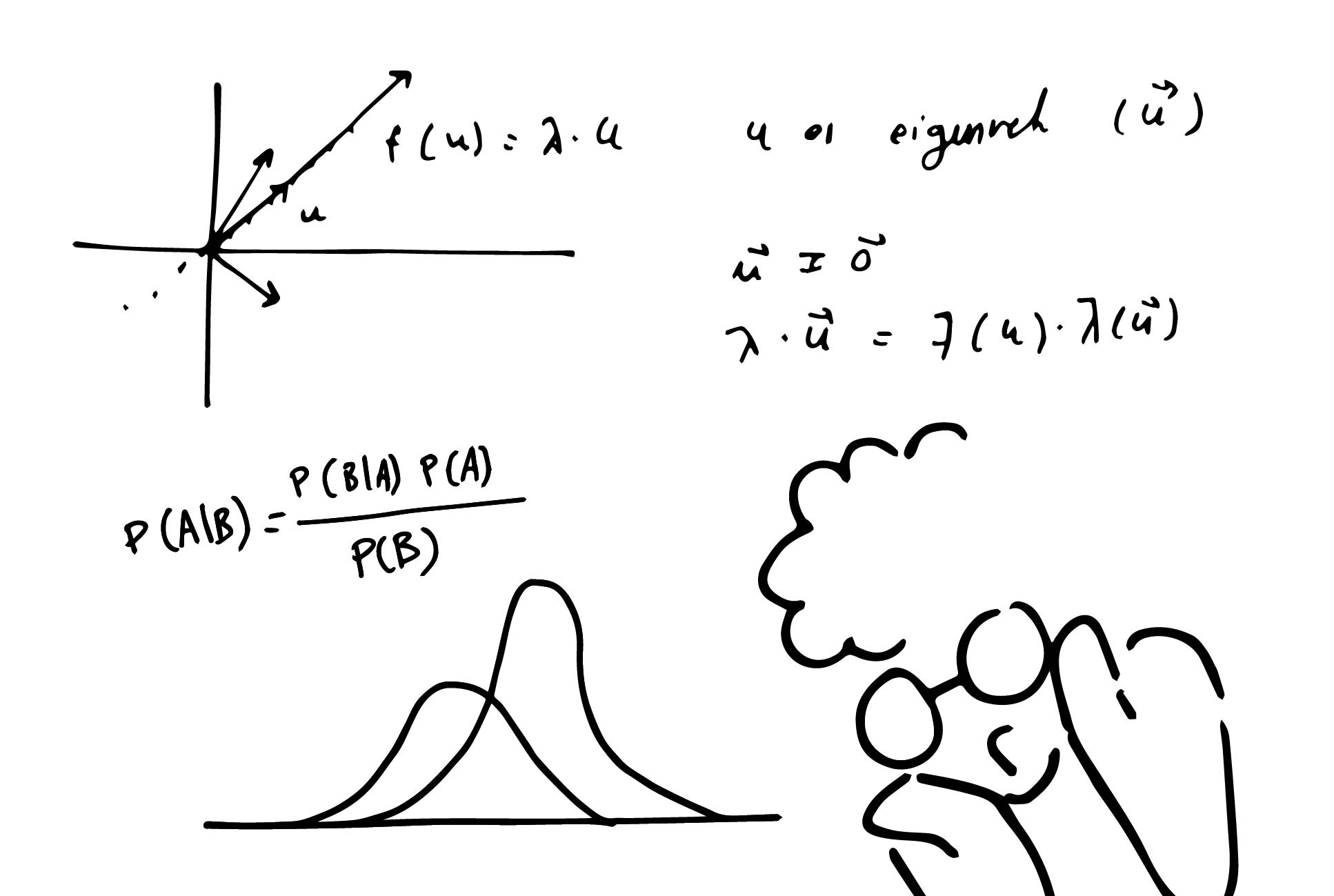
Download my doodles!
I have just started a new section on my blog where you can download some of my drawings. You can already find some biosafety doodles there. My plan is to keep adding some of the material I create for my own posters and presentations. Check it out! 🤓
-
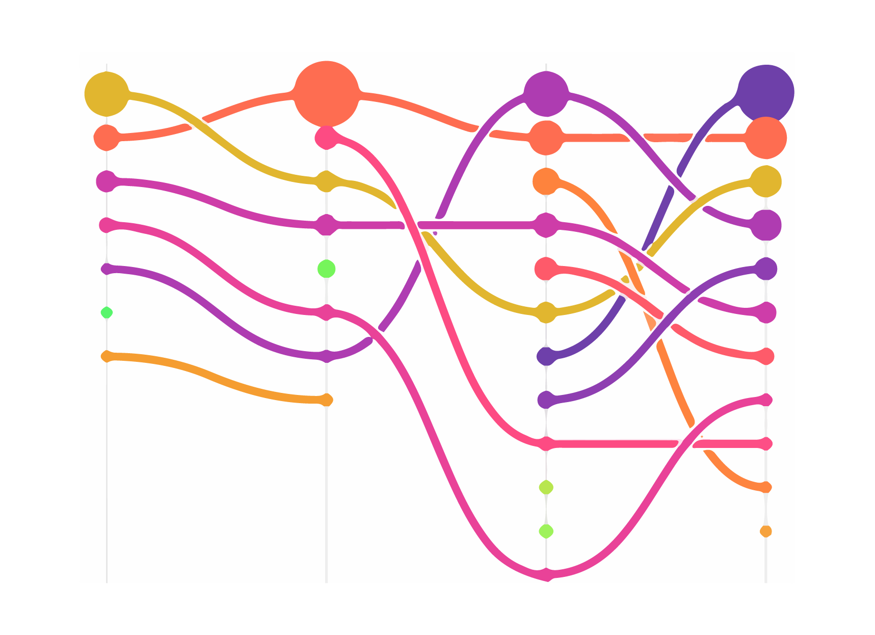
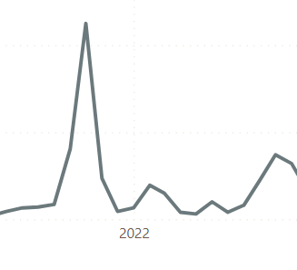
Dataviz – 20 years of outbreak notifications
After a lot of talk about data science, dataviz finally returns to the blog! This graph shows the historical trends of several animal diseases in Spain since 2001. The data comes from the Red de Alerta Sanitaria Española (RASVE), which acts as a central hub for coordinating animal disease surveillance, control measures and information dissemination…
-
Getting into data science – 3. Find data and play
What can you find when you search for data? In this post you will find a list of useful databases for practice and an introduction to basic concepts about data tables, databases, APIs and their documentation.
-
Getting into data science – 2. Get nerdy
After having a look at some data analysis tools, in this second post I’m sharing resources about statistics, mathematics and programming that have helped me do better data science. What I present here is not always necessary to start working with data, but I will try to convince you that it is worth it.
-

Getting into data science – 1. Know your tools
This post series is for anyone who’s ever asked me about the world of data analysis, who wants to be a bit more nerdy and go beyond Excel. In this first post we take a look at some data analysis tools and resources to get you started.
-
RASVE Dashboard
Dashboard for the visualisation of outbreaks of notifiable animal diseases reported in Spain through RASVE
Want to contact me?